
Journey
UX Case Study
Overview
Journey is a social networking platform that brings together content creators and vibrant communities of shared passions and hobbies. My role as a UX/UI design intern consisted of redesigning many features of the application including the creator landing page, community feeds, member profiles, and designing a new features to host community events.
Role
UX/UI Designer Intern
Duration
March - July 2022 | 16 weeks
Contributors
Shenghan Gao
Bijou Kim
Over the course of 16 weeks I was at Journey as a UX/UI Design intern, I had the opportunity to work on a few different projects of my choice. My most significant projects were the User Profile Page and Journey Landing Page for web.
User Profile (Member)
Journey has two types of users: content/community creators, and community members. For my first project, I designed the member profile view and updated the existing features in the UI.
Profile Page Design
The frame on the left was the existing UI when a user goes into another user's profile page. It displays the user's name, biography, personal links, and the communities that they are currently a part of. There is a profile photo reel fixed at the top of the page to showcase a user's hobbies and interests.
The right frame is essentially the same UI-- I made some small design changes to adjust the view for when a user goes into their own profile.

A user can follow or private message a user through their profile.
View a user's joined communities.

Chat button is removed; the follow button is changed to an edit profile button.
"Join" buttons are removed; community icons indicate the user's position within the group, such as member, admin, etc.
Edit Profile
I designed the "edit profile" page where a user can update their personal information as well as edit their profile banner (profile reel) photos. The goal when designing this page was to make the process as simple and intuitive as possible.

Users can edit their profile pictures and text fields.

Profile reels consist of 6 photos.

User can select photos from their personal gallery or their "journeys", a feature in the app where you keep track of goals with photos.
Edit Profile (Journeys)
Every user has a "journey" feature. This is where a user can keep track of their goals, milestones, and achievements by posting photos of the process. Scrolling down from the profile page displays all of the user's journeys. For this feature, I designed the journey editing properties, and added a feature where a user can directly add a photo from their journey to the profile reel.
One of the pain points I tried to solve here was the struggle of navigating back and forth from a user's journey and profile edit page when updating the profile reel photos. Before this design, if a user wanted to add a photo from their journey to their reel, they were required to go back into the photo gallery and find the original photo. This design creates a much smoother user flow, while also allowing users to customize their journeys and reel photos quickly and efficiently.
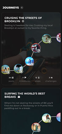
This is the existing user journey UI scrolling down from the profile page. I added the privacy indicator icons next to each journey.

Going into a journey looks like this. The roadmap was designed to display each step of the user's journey.

The Post to Journey button will automatically collapse after 2 seconds. We wanted to prevent the page from looking cluttered.
Redesign: Creator's Landing Page for Web App
For my second project, I redesigned Journey's creator landing page to create a more impactful user experience.
Original Design
The purpose of the creators' landing page is to introduce the idea of becoming a creator on the Journey app. It displays the perks and benefits of becoming a creator, and what the onboarding process will look like. This is the original design:

Landing Page is cluttered and cramped together.
.png)
Too much text for testimonials creates a cluttered, wordy look.
.png)
Pictures add no meaning or value in relation to the presented copy.
Redesign
Overall, I carried over some consistent properties with the use of color and layout from our existing design system. However, there were some significant changes.
Text / Copy: Text styles were updated to establish a heavier hierarchy between the heading and body text. The body text was too large in comparison to other elements, detracting from the visuals included in the page. Phrases and titles were reworded to more effectively deliver our message to the user.
Visuals: Instead of static images, I suggested the idea of having dynamic visuals including interaction clips and GIFS. This would engage the user more effectively and stir up curiosity for the features that the app offers.

Text style has a more emphasized hierarchy, creating a cleaner, more organized look.
.png)
Testimonials are redesigned in a less cluttered manner. Referencing the creator's socials also establishes a more reliable and trust source.
.png)
Instead of static images, GIFs and interactive videos will replace the visuals. The first section will display a SEO interaction, and the second section will show a creator navigating through comments.
Those were the main projects that I had the opportunity to work on during my time at Journey. There are a couple other small projects that I had worked on-- connect with me and I am open to sharing them with you 🙂
Retrospective
Takeaways
This internship was an extremely rewarding experience that helped me grow in many areas as a UX designer. I had the opportunity to experience many things for the first time, including solving problems of many different scales, presenting my designs to a team, and organizing design handoffs to developers. I was given the freedom to dapple in many different projects and areas, which helped me discover my areas of strength and weaknesses as a designer. Here's what I learned:
✨ I enjoy design and problem solving rather than focusing too much of my energy researching growth methods.
✨ I have a bad habit of taking on too much workload and responsibilities. This hinders my ability to work effectively and efficiently.
✨ I am very meticulous and detail-oriented.
The most important lesson and takeaway I learned from my time at Journey is that the UX design process is not linear. Throughout academia and self study, I thoroughly learned the UX process in rigid, organized steps. However, with the hands-on experience of designing solutions and working for a start-up, I was able to embrace this non-linear process and learn to trust my skills and process no matter how rocky the journey was in between.
Last but not least, another valuable takeaway is that enjoyed collaborating with other designers and regularly giving/receiving feedback. It challenged my comfort zones in many ways and overall made me into a stronger, more confident designer. I am looking forward to continue to grow and apply these skills into my future opportunities!