SuavOS
UI Design | Mobile Application Design
Overview
Designed a mobile operating system in a span of 10 weeks. Meet SuavOS— a mobile OS perfect for young adults and working individuals. Customizable for a personal touch and designed to optimize productive workflows.
Role
UI Designer
Duration
September - December 2021 | 10 weeks
Contributors
Bijou Kim
Sneha Reddy
Anika Mishra
Jerry Wang
Yeonsoo Park
Franchezca Layog
Tracy Tai
"You have 10 weeks to build a mobile operating system. Ready, set, go."
- Brian Fling, our Mobile Application Design Professor
Where to Start?
No lectures, no homework, no assignments. Just design a mobile OS in 10 weeks and present it at the end of the quarter.
I remember the tension in our first group studio session. The silence was deafening. We had absolutely no idea where to start, as we were not given any instructions nor any type of project structure. None of us have had prior experience designing an OS. All in all, it was nerve-wracking, anxiety-inducing and exciting— all at the same time.
Brainstorming
Diving In
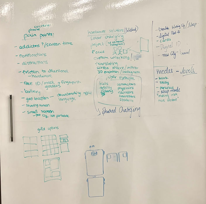
For our first step, we listed out a wide range of general pain points in existing operating systems. Below is our initial brainstorm, without any limitations. It is quite messy and extensive— the key takeaway from this chart is that there was a common pain point listed across multiple members: a lack of concentration and distractions preventing efficient workflows.
.png)
We identified that these pain points affect those in their late teens to early 30’s— the typical age range before people tend to hustle to establish a stable lifestyle. After many hours of brainstorming different ideas and how we can bring change with our OS, we established a device concept and audience: A mobile OS designed for working & active adults who strive to optimize productivity in their daily lives.
Below is our brainstorm for the different pain points that our OS can address. We have narrowed the main issues to address as the following
-
Excessive screen time
-
Distracting notifications & applications
-
Separate work spaces to make the OS a more productive tool.
An initial solution was to create customizable “modes” shown in the right column such as work mode where the user can customize features to match their preferences .
Concept & Design Principles
After solidifying our device concept & ideation, we established the following principles for our foundation.
Productive
Personal
Innovative
Minimal
It's simple, knows exactly what you want, and is customizable and personal to you. It's smooth, fast, and innovative, lending itself to your daily life how you want it, ready for productivity or play.
We solidified our progress & continued our project journey by asking the following question:
How might we create an innovative & personal mobile OS to provide users with a productive workflow?
User Research
We briefly conducted research through a few user interviews who use Android and iOS devices. We asked the following questions:
-
How do you feel about your mobile device? What about its hardware? It's software/OS?
-
How do you manage work/school/personal stuff on one mobile device?
-
What about iOS/Androids works for you, what doesn’t work? What pain points exist with your phone?
Here are some key takeaways:
1
Users try to organize the multiple types of content on their devices into folders or screens.
2
Some users "hide" certain apps to prevent themselves from being distracted.
3
Many users reported enjoying the design of Apple products and the modes features.
4
Users often feel distracted from the excessive and distracting features on their mobile devices.
Mood Board
Our mood board displays themes of productivity, simplicity in UI design, smooth & efficient workflows across the UX elements such as drawers, cards, and contrasting but muted colors.

Design Direction
We established these following patterns to be consistently displayed throughout our OS applications.
Categories
Categories to organize content-- easy access & efficient workflows
List & Table View
List views organize categorical elements, table views for content within categories-- space efficient and smooth flow
Widgets
Encourages productivity and personalization
Minimal Curvature
Sophisticated and simple appearance
Low-Fidelity Wireframes
Applying these UX patterns and design principles, we came up with our first low fidelity frames. We attempted to apply the design patterns across different applications to see how we can create a consistent UX experience across our OS. This was a huge challenge, as creating a consistent UI among applications that are inherently different in their purposes and functionalities is extremely difficult. The frame below is our first ideation for our Mail app.


Everything is going great so far! We got our vision board, design patterns, and our wireframes.
We’re all set for success!
. . . right?
Nope, we encountered a problem.
At this point in our journey, we came across a difficult stage. We constantly came across flaws in our design ideation and failed to integrate consistent design patterns into the apps. We slowly experienced a burnout facing so many different decisions to be made.
After many studio sessions, we finally identified the key factor that had been putting a strain on our designs.
One of our main UX patterns was a left-gesture drawer element (shown below) that would be swiped to access in-app functionalities and navigations. Instead of the generic hamburger menu or tool bar at the bottom of the screen, we wanted to implement a unique and unprecedented UX pattern that would be consistent throughout our OS.
.png)
The left drawer is accessed with a left-to-right swipe from the edge of the screen.
Why did this not work?
-
We realized that not all applications require a menu/tool bar. This depends on the functionalities and complexity of the app’s elements. For example, the Mail app requires much more features such as multiple inboxes, mail tags, and categories. However, Contacts & Dialer do not.
-
However, adding this feature to only a selection of apps creates a risk of presenting a confusing UX pattern to the users.
-
The feature was not intuitive, as there was no indicator of the left-drawer.
It was very difficult to remove this feature from our designs as we had spent a great amount of time designing it and incorporating it into our applications. After a long debate and additional studio sessions, we finally decided it was time to explore other options.
Final Product
Lock Screen & Work Mode

Lock Screen
Direct notifications from calendar & notes. Work mode will hide notifications from certain apps.

Control Center
Slide down from home screen to see detailed functions including wifi, bluetooth & work mode.

Work Mode Settings
Open work mode (see next frame) settings from the control center. Manage preferences with reminder messages & allowed notifications.
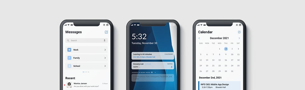
Messages & Mail

Messages Home
Customizable categories within the Message app and a list of message threads in order of recency.

Category View and Actions
Categories allow easy organization and access to contact groups. Slides for quick actions.

Conversation
A message thread is detailed with a customizable background and multi-media functions.
Browser

Browser Home
Contains recommended links, synced from other OS applications and third party apps.

Browser Drawer
When swiped up, favorited websites are displayed, organized by category. These can be personalized in the user's settings.

Tabs & Workspaces
The browser has a feature to create workspaces. The user can organize their work flows and maximize productivity through this feature.
Calendar & Notes

Agenda View
View daily, weekly, and monthly agendas. Colors can be customized and changed through settings.

Event View
No more searching for event links and docs—view everything in one place. This allows for productive and efficient workflows.

New Event
Easily create new events and organize all necessary information.
Contacts & Dialer

Dialer
Similar to the lock screen, we have a simple dialer button and layout to make it look neat yet useful.

Recents
Sort and filter the recents by all, missed, and unknown.

Contacts
Similar to Messages, contacts can be organized in the user’s customized categories.
Maps & Weather

Navigation
Tap Maps Reminders to easily start frequent navigation routes.

Explore
View local guides and easily switch between transportation modes.

Weather
Smooth information flow, starting from weekly, current, and today’s timeline with other relevant weather information.
✨ Retrospective ✨
What went well?
Overall, this project was a rollercoaster— we had our highs and lows. Our team reached our pivotal point much later on in the design process, and immediately our ideas flowed much more efficiently and we became more confident in our decisions. Looking back to the beginning of the quarter, we had no idea that this would have been possible. We created a product that we are extremely proud of as a team and have learned a great amount of lessons throughout the design process. In terms of our product, I believe we did a great job of applying our design principles across the different applications.
What were some challenges?
Working with a team of 7 people was not easy. Everyone had different opinions from the small to big aspects—in the UX flow, the UI design, and general direction of our product. The biggest challenge of this project was navigating through all of these diverse perspectives and really coming together as a team to determine what the best next steps are when we stuck in our design process.
What would I have done differently?
The biggest lesson I learned from this experience is that the method of team collaboration has a tremendous impact on design outcomes. During this project, our team members worked too independently— we assigned ourselves to specific apps, then came together to discuss. It was hard to scratch original works of team members so we tried our best to salvage original designs. This caused a few inconsistencies in our designs across our apps and it was evident that we didn’t tackle some parts with a unified outlook. Next time, I would change the way my group and I collaborate by working on each task as a unified group to ensure that every little detail of the design process is justified and consistent.